Complexity is Simple

I was taken with this cartoon and the comments put up by Hugh Macleod last week over at his gapingvoid.com blog so I hope he doesn’t mind me reproducing it here.

Complexity is Simple (c) Hugh Macleod 2014

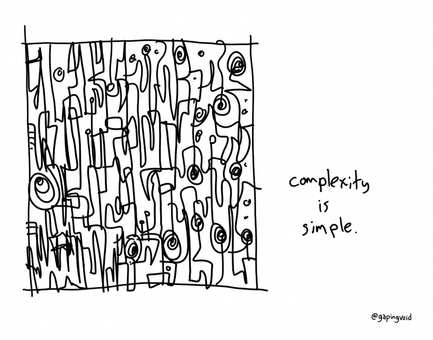
Complex isn’t complicated. Complex is just that, complex.

Think about an airplane taking off and landing reliably day after day. Thousands of little processes happening all in sync. Each is simple. Each adds to the complexity of the whole.

Complicated is the other thing, the thing you don’t want. Complicated is difficult. Complicated is separating your business into silos, and then none of those silos talking to each other.

At companies with a toxic culture, even what should be simple can end up complicated. That’s when you know you’ve really got problems…

I like this because it resonates perfectly well with a blog post I put up almost four years ago now called Complex Systems versus Complicated Systems. where I make the point that “whilst complicated systems may be complex (and exhibit emergent properties) it does not follow that complex systems have to be complicated“. A good architecture avoids complicated systems by building them out of lots of simple components whose interactions can certainly create a complex system but not one that needs to be overly complicated.

Social Objects as Instruments of Architecture

According to Hugh MacLeod a social object:

is the reason two people are talking to each other, as opposed to talking to somebody else.

also:

social networks are built around social objects, not vice versa. The latter act as “nodes”. The nodes appear before the network does.

In discussions around architecture there can often be much confused talk around what is needed, what an architecture looks like and what decisions need to be made in order to make it so. There are three useful architectural social objects that help cystalise our thoughts and  allow a network of related artefacts to be created. These are:

  • Use Cases or Scenarios – Illustrate what I am trying to do via real-world examples that use human actors to illustrate what we are trying to achieve.
  • Architecture Overview – The main architectural elements (components) that the system is comprised of.
  • Architecture Decisions – What decisions am I making, what options did I consider and why did I choose the ones I did.

These social objects seem to apply to all levels of architecture from the smallest application to the largest enterprise architecture. Of course they are by no means all you need but serve as a pretty good starting point for all that follows.

Six Non-IT Books for IT Architects

There are now several myriad books out there on the topic of software architecture, including this one I have contributed to. There are other skills an architect needs to do their job which are not just to be found in IT books however. Here are six books which have helped me in my job together with a few reasons why I think they are useful:

  1. Change by Design by Tim Brown. Tim Brown is the CEO of IDEO a design company based in Palo Alto, California. Introduces the concepts of “design thinking” that can be applied to any problem and shows how empathy, play, storytelling and prototyping can all be bought together in coming up with new and innovative designs. Top tip: Deploy interdisciplinary teams of multi-talented people (i.e. true versatilists) to solve hard design problems. Even if you don’t get the book at least visit the link I’ve given to view the wonderful mid map.
  2. Presentation Zen by Garr Reynolds. Garr is the master of giving advice on how to create simple, clear and relevant presentations. Here he applies the zen principles of simplicity that will change how you think about creating presentations using PowerPoint or Keynote. Top tip: Picture superiority effect. Pictures are remembered better than words. Humans are hardwired for using images to communicate. Go visual wherever and whenever you can.
  3. A Whole New Mind by Dan Pink. Dan describe how, if we are to survive in the 21st century world of work, we must make more use of the left side, the creative side, of our brain rather than the traditional right (logical thinking) side. Top tip: Use stories to help illustrate your ideas. Stories represent a pathway to understanding that doesn’t run through the left side of the brain.
  4. Notes on the Synthesis of Form by Christopher Alexander. Alexander recognises that problems come with multiple, poorly understood requirements that interact with each other, creating conflicts and contradictions. Something we in IT have known for years. This book describes an approach for dealing with often multiple conflicting requirements to come up with the “best fit” solution. Top tip: It is difficult to specify a complete set of requirements that need to be met to achieve a “best fit”. A practical approach is to define ‘good fit’ as the absence of ‘misfits’, since these are usually what makes the problem obvious and can be ascertained through inspection of prior designs. Although designers may argue over the importance of a particular misfit, they are less likely to disagree on whether the misfit exists.
  5. Ignore Everybody by Hugh MacLeod. Hugh is an artist that makes a living creating art on the back of business cards, selling wine and running an extremely insightful web site on applying creativity to help you improve your job as well as your life. Top tip: Don’t try to stand out from the crowd, avoid crowds altogether.
  6. The Presentation Secrets of Steve Jobs by Carmine Gallo. Great book with lots of example on how Steve Jobs creates, prepares for and delivers his presentations to introduce new Apple gadgetry on the world. Top tip from book: Use plain English and photographs rather than techno mumbo-jumbo and slides densely packed with indecipherable text and bullet points.

It’s Easy to Spot a Purist…

…they’re the ones with no skin in the game. I came across this whilst reading about Hugh MacLeod’s new book on his blog. It set me thinking about how true this can sometimes be from an architecture perspective. Steve Jobs famously said “real artists ship”. Whilst there is a point to building good architectural models, defining principles that should be followed and road maps that describe the directions architects will be travelling in there comes a point that we must say “enough is enough, it’s time to ship”. The fact of the matter is that software development is, and always will be, a complicated activity and there is often no clearly defined answer to the wicked problems we need our systems to address. In fact, two of the attributes of a wicked problem namely, wicked problems have no stopping rule (instead the problem solving process ends when you run out of resources rather than when some ‘correct’ solution emerges) and solutions to wicked problems are not right or wrong (they are simply better, worse, good enough or not good enough) would seem to encourage the kind of purist behaviour where nothing ever ships. The danger with architecture (especially Enterprise Architecture) is that the artefacts being created are intangible things like models, road maps and principles and these by themselves do not make working systems. The people that produce such artefacts could often be accused of having “no skin in the game”. So how should you ensure that the architects in your organisation do indeed have skin in the game and knows that shipping is actually all that matters? Here is my SKIN (Specify Kill Integrate Negate) rule of thumb for ensuring delivery takes protracted (and unnecessary) analysis.

  • Specify to the right level of abstraction and detail, no more no less. The models, road maps, architectural principles that are defined by architects should be understood and usable by as many stakeholders as possible. This may mean having different views (levels of abstraction) of the same model but ensure if this is the case, those views are consistent. Think who your stakeholder is meant to be before building the artefacts and don’t build it if you can’t explain it clearly to that stakeholder.
  • Kill unwanted artefacts. Sometimes with the best will in the world you will build an artefact that does not have a purpose, is not read by anyone or has expired. Kill it, don’t let it linger on causing confusion and giving you an unnecessary maintenance overhead. Look at something like TOGAF for a good set of useful artefacts.
  • Integrate the work of the architect(s) with real downstream activities. Don’t let them work in ivory towers which have no grounding in reality. When planning a project and considering what artefacts need to be planned it is useful to think of what the inputs are to the task that is to create the artefact. If you cannot see any of the artefacts that are output from architecture tasks being used than maybe it’s time to consider killing off those artefacts (see above).
  • Negate unnecessary activities and tasks. Every task should have an output. This is usually in the form of a work product (a model, a piece of code, a plan or whatever). If you find you have some architecture tasks or activities (groups of relates tasks) that are not producing useful artefacts then its probably time stop performing those tasks.

Architecture vs. Design

Yes it’s that old knotty problem again! Over at gapingvoid.com Hugh MacLeod is fond of using Venn diagrams to illustrate overlapping concerns so here’s one that I recently used for addressing the eternal architecture versus design debate that was the source of much discussion at a recent Architecture Thinking class I was giving.

As I remember it the discussion went something like this:

  • Student: So what’s the difference between architecture and design? It seems from what you’re saying its just a matter of scale?
  • Me: Whilst its true to say that architecture addresses the major components of the system, rather than the detail, it’s more than that. The architecture is the bridge between the “what” (that is the requirements) and the “how” (that is the design).
  • Student: Yeah but isn’t that we usually call “high-level design”.
  • Me: Not really. Grady Booch says: “All architecture is design but not all design is architecture”. (I cheated and looked up this quote afterwards and found that Booch goes on to say “architecture represents the significant design decisions that shape a system, where significant is measured by cost of change.”). In my experience high-level design is just the the view that allows the complete system to be represented on one page.
  • Student: I still don’t see what the difference really is.
  • Me: Okay, here’s the real difference for me (at this point I draw the above Venn on a flip-chart). As well as defining the structure of the system, architecture must also embrace the “what” and the “how” of that structure.  The “what” in this context is the requirements (functional and non-functional) and so architecture involves reasoning about and resolving these sometimes conflicting requirements. It’s about addressing those architecturally significant requirements (the “what”) that will drive (and constrain) the “how” (the design).

Now, if I was drawing this again (and maybe I’ll do this next time) I would actually draw a third overlapping circle which I’d label the “why”. This is where we’d capture the rationale for why we make the (architectural) decisions we do.

Thanks Hugh, this is a neat way of explaining the way things are!

Design Really Does Matter

I’ve just received a new work laptop and what a monstrosity it is! There was a time when ThinkPads were actually quite sexy as far as laptops go but this model (a T400 if you’re interested) is a complete abomination of a thing. It’s not only square and clunky feeling but for some mysterious reason the designers have made the battery stick out of the back like some large cancerous growth. Why, if Apple can design a laptop with a supposed 6 hour battery life where the battery is hidden completely inside the case do Lenovo designers have to create something that has the battery hanging out the back and appear to offer no more life?

What’s all this got do do with the zen of architecture you might ask? I’ve been reading the latest book by Garr Reynolds, Presentationzen Design where Garr suggests we should take inspiration for good design from the products we see around us all day. The ThinkPad would seem to be a good design antipattern to me. Of course, as Hugh MacLeod says “there’s no correlation between creativity and equipment ownership” and “a fancy tool just gives a second-rater one more pillar to hide behind.” That said, I feel sure that using a tool that is both good to look and is well designed makes for an all round better experience that must aid in the flow of the creative juices. If you don’t have the ideas in the first place then the best tool in the world won’t help you create them but if you do have something to say what would you rather write with, the free pen from the hotel room or the Mont Blanc you got for Christmas?